
Design system — czym jest i dlaczego warto go stworzyć?
W design system Product Designerzy dokumentują swój własny proces myślowy, podczas projektowania witryny internetowej i aplikacji. Dla kogo dedykowany jest design system? W tym artykule znajdziecie odpowiedzi na wszystkie pytania oraz wskazówki dla projektantów UI — jak efektywnie stworzyć design system.
Co to jest Design System?
Design system (system projektowy) to zestaw narzędzi i zasad projektowych, które służą do opracowywania spójnych i zgodnych interfejsów użytkownika (UI) dla różnych aplikacji i serwisów internetowych. Design system zawiera takie elementy, jak np. styleguide (przewodnik po stylu), komponenty interfejsu, kolory, czcionki i inne elementy projektowe, które są dostępne dla całego zespołu projektowego i mogą być stosowane w różnych projektach.
Design system ma na celu zapewnienie spójności i jednorodności wyglądu i funkcjonalności różnych aplikacji i serwisów, co ułatwia użytkownikom korzystanie z nich i zwiększa ich zaufanie do danej marki. Design system jest też przydatnym narzędziem dla projektantów interfejsów, ponieważ pozwala im na szybsze i łatwiejsze opracowywanie rozwiązań projektowych i unikanie błędów związanych z projektowaniem interfejsu.
Może być stosowany zarówno w małych projektach, jak i w dużych organizacjach, gdzie występuje wiele różnych aplikacji i serwisów internetowych, które muszą być zaprojektowane i utrzymywane.
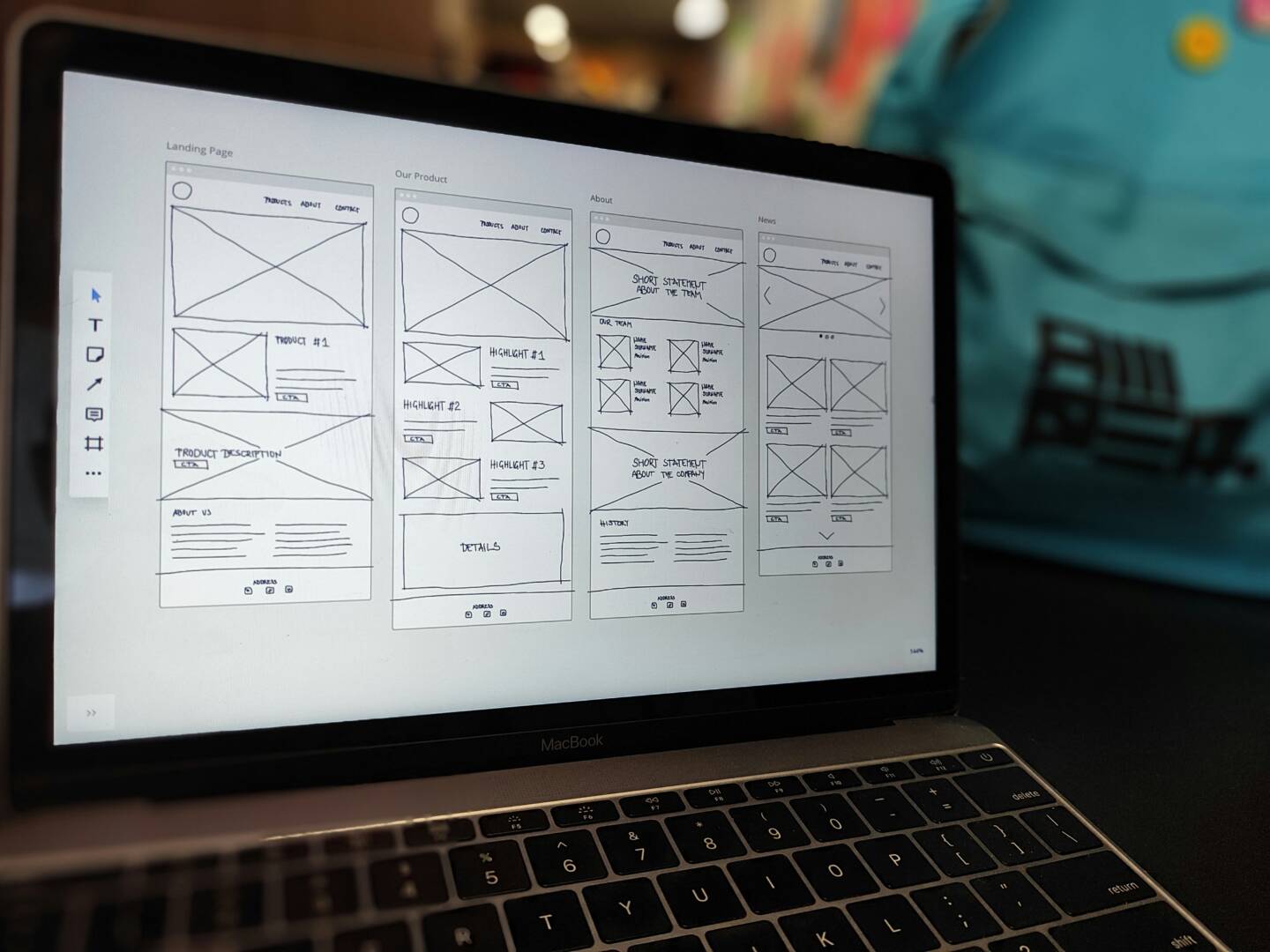
Proces tworzenia design system
W niektórych przypadkach design system ma służyć jedynie jako źródło wytycznych dla zespołu developerskiego, który będzie mógł wdrożyć spójny projekt tworzonego produktu cyfrowego. Jednak jest on też ułatwieniem dla samych projektantów, którzy podczas pracy nad dużymi projektami mogą w każdej chwili skorzystać z design systemu i szybko przypomnieć sobie, jak wyglądają i zachowują się komponenty.
Paleta kolorów i typografii
Kolory oraz typografia strony internetowej lub aplikacji to jedne z pierwszych elementów, które zostają określone na początkowym etapie projektowania wizualnego.
Sprecyzuj swoją paletę kolorów
W zależności od tego ile kolorów chce się umieścić w style guide, sekcja z paletą kolorów może zawierać kolory główne i uzupełniające. Określając paletę kolorów podstawowych, należy zastosować ją do wszystkich komponentów, m.in.:
- Przyciski (CTA – call to action)
- Linki
- Nagłówki stron
- Elementy formularzy (inpoty, selecty, checkboxy, radio, itd).
Ważne jest również zdefiniowanie kolorów elementów systemowych, które pokazują np. ostrzeżenia, błędy, informacje.
Wybór kolorów tekstu
Na początkowym etapie prac projektowych można dać się ponieść fantazji i określić kolory tekstowe nieadekwatne do całości projektu. Warto określić kolory do następujących typów tekstów:
- akapitów tekstów
- linków
- komunikatów systemowych
- nagłówków
Ogranicz paletę kolorów do maksymalnie trzech lub czterech kolorów. To sprawi, że projekt nie tylko będzie spójny i estetyczny, ale także zmniejszy nakłady finansowe w trakcie programowania CSS witryny.
Projektowanie typografii
Podczas projektowania typografii należy upewnić się, że czcionka jest czytelna i estetyczna na różnych platformach. Wymaga to wszechstronnej znajomości wszystkich urządzeń i platform, na których będzie używana Twoja witryna lub aplikacja.
Aby czcionka była czytelna, należy stosować czcionkę w rozmiarze nie mniejszym niż 12-14 punktów.
Kluczowe punkty, o których należy pamiętać podczas projektowania typografii:
- Określ minimalny rozmiar czcionki, aby zapewnić czytelność i zadbać o estetykę projektu
- Trzymaj się jednej rodziny czcionek, lub użyj wiedzy na temat ich parowania,
- Zdefiniuj rozmiary czcionek dla tytułów stron, różnych poziomów podtytułów i akapitów. Wyraźnie rozróżnij te elementy za pomocą rozmiaru, grubości i koloru czcionki. Nie zapomnij o określeniu interlinii, aby treści były czytelne i estetyczne.
Określanie wymiarów
Niezależnie czy pracujesz sam, czy w zespole projektantów, konieczne jest określenie warunków rozmiarów dotyczących odstępów i układu witryny lub aplikacji.
Nie ma gotowych i twardych zasad określania wymiarów poszczególnych elementów interfejsu. Mimo to warto na samym początku je dokładnie określić, aby zachować spójność projektu.
Wiele platform udostępnia poradniki dla programistów, w których sugerują określone odstępy, marginesy i wypełnienia elementów interfejsu np: https://material.io/design/layout/spacing-methods.html#spacing
Ergonomia wizualna design system
Każdy projektant powinien mieć przynajmniej podstawową wiedzę na temat zasad użyteczności i ergonomii wizualnej. Warto definiować elementy interfejsu użytkownika w przynajmniej trzech rozmiarach: małym, średnim i dużym.
Każdy z tych rozmiarów można przypisać do innego typu przycisku w zależności od wagi wizualnej. Przykładowo przycisk “Kup teraz” jest ważniejszy (ma większą wagę wizualną), więc musi być większy od uzupełniającego przycisku „Opinie”.
Projektując dotykowy interfejs użytkownika, należy określić odpowiednią szerokość i wysokość elementów, aby przyciski były łatwe w użytkowaniu. Minimalny zalecany rozmiar komponentów interaktywnych wynosi 40x40pt.
Narzędzie, które żyje
Design system to narzędzie, które nie jest statycznym dokumentem, lecz żywym organizmem, stale ewoluującym wraz z rozwojem produktu. Warto opisać, kiedy z czego korzystać w design systemie, wskazać przykłady i poprzednie wdrożenia. Dobra dokumentacja łączy projektantów z developerami, dlatego warto nie pisać jej tylko z jednej perspektywy.
Jego skuteczność zależy od bieżącej aktualizacji – jeśli zaniedbamy optymalizację i dostosowanie do zmieniających się potrzeb, szybko stanie się martwym zbiorem zasad, z którego nikt nie będzie korzystał. To także wspólna przestrzeń, w której każdy członek zespołu – od projektantów po programistów – powinien mieć możliwość zgłaszania sugestii i wpływania na jego rozwój. W teorii brzmi to prosto, ale w praktyce wymaga zaangażowania i dobrej organizacji pracy.
Wiele systemów dostępnych w sieci prezentuje się świetnie wizualnie, jednak często okazuje się jedynie Design Kitem – narzędziem przydatnym głównie dla projektantów, zamiast pełnoprawnej biblioteki kodu wspierającej również programistów frontendu. Dlatego kluczowe jest, aby design system był przemyślaną, kompleksową inicjatywą, łączącą potrzeby wszystkich zaangażowanych w proces tworzenia produktu.