
Heurystyki Nielsena – 10 zasad dobrego UX
Dobre projektowanie to nic innego jak tworzenie określonego produktu z myślą o tym, jakie doświadczenia związane z tym produktem będzie miał jego użytkownik. Dotyczy to wszelkiego rodzaju projektowania, od produktów użytkowych, po interfejsy użytkownika.
Chciałbyś zaprojektować sklep internetowy, tak, aby klienci chętnie do niego wracali? A może próbujesz wdrożyć aplikację i nie do końca wiesz, czy zadowoli odbiorcę? Na pomoc przychodzi Jakob Nielsen wraz z Rolfem Molichem, którzy w latach 90. XX wieku stworzyli listę 10 heurystyk, czyli ogólnych zasad, według których projektowanie ma być zorientowane na odbiorcę. Stosując te zasady, unikniesz problemów z użytecznością, które wynikają z najczęstszych błędów popełnianych przy projektowaniu. 10 heurystyk Nielsena można traktować jako swoisty dekalog projektowania UX:
Pokazuj status systemu
Chodzi o to, aby użytkownik zawsze wiedział, co aktualnie dzieje się w systemie, co pomaga zredukować niepewność, budować zaufanie oraz zwiększać komfort korzystania z produktu. Użytkownicy oczekują, że system będzie reagował na ich działania i jasno informował o tym, co się dzieje. Kiedy system nie daje żadnej odpowiedzi, użytkownicy mogą czuć się zagubieni i niepewni, czy wykonana akcja była poprawna. W skrajnych przypadkach brak informacji zwrotnej może prowadzić do frustracji i rezygnacji.
Na przykład zamawiasz jakiś produkt w sklepie internetowym. Wkładasz go do koszyka i przechodzisz do kasy. Powinieneś wiedzieć ile kroków ma kasa, na którym jesteś i jaki będzie następny (np. jesteś na podaniu danych dostawy, a czeka jeszcze wybór płatności).
W witrynach, które służą do konwertowania plików, dokładnie pokazany jest każdy krok procesu i bardzo często na bieżąco widać postęp przetwarzania, czy pobierania pliku.
Status systemu doskonale widoczny jest również w aplikacjach służących do zamawiania jedzenia. Czekając na dostawę, możesz sprawdzić, kiedy otrzymasz upragniony lunch.
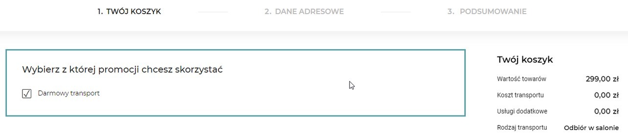
Przykład sklepu internetowego, gdzie widoczna jest ścieżka zakupowa. Wiemy gdzie jesteśmy i co nas czeka.

Platforma Disney Plus pokazuje, pokazuje licznik odmierzający czas do wyświetlenia kolejnego odcinka. Wyobraźcie sobie sytuację, w której odcinki odpalają się bez ostrzeżenia, dziwne, prawda?
Zachowaj zgodność pomiędzy systemem a rzeczywistością
Strona internetowa czy system powinny „mówić” zrozumiałym, prostym językiem, tak, aby każdy odbiorca mógł się w nich dobrze odnaleźć. Skomplikowane opisy czynności czy techniczny język, zrozumiały jedynie przez specjalistów, spowodują frustrację i niechęć.
Wykorzystanie tej heurystyki dobrze widoczne jest na przykład w interfejsach smartfonów, gdzie ikony doskonale odwzorowują funkcje aplikacji. Chcąc wyłączyć dźwięk w czasie rozmowy, klikniesz mikrofon, a chcąc odtworzyć muzykę, użyjesz przycisków znanych z fizycznych odtwarzaczy.
Wizualizacja fizycznych elementów systemu i prosta do rozróżnienia komunikacja, to spełnienie tej heurystyki
Daj użytkownikowi pełną kontrolę
System powinien umożliwiać cofnięcie, ponowienie, anulowanie lub edytowanie działań w dowolnym momencie, co zapewnia użytkownikowi poczucie kontroli nad procesem. Gdy użytkownik ma możliwość korygowania swoich działań, jego komfort i zaufanie do systemu znacząco rośnie. Doskonałym przykładem jest możliwość cofnięcia przez kilkanaście sekund wysłanej wiadomości w aplikacji Gmail, na wypadek gdybyśmy kliknęli „wyślij” przypadkiem.
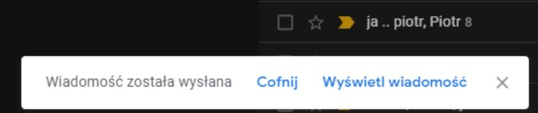
Wspomniana możliwość cofnięcia wysłania wiadomości
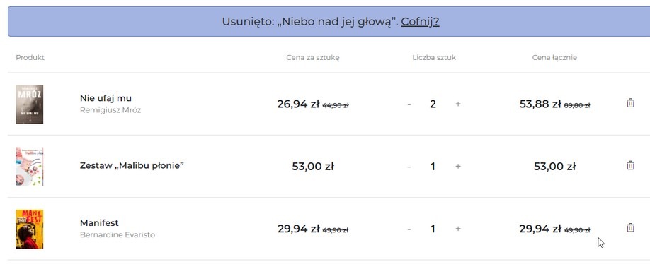
Możliwość cofnięcia usuniętego produktu z koszyka w sklepie internetowym
Trzymaj się standardów i zachowaj spójność
Wyobraź sobie, że wchodzisz na stronę internetową, gdzie na każdej podstronie są inne ikony powrotu do strony głównej. Do tego różne fonty, mix kolorów, a menu raz u góry, a raz z boku. Nieintuicyjnie, prawda?
Spójność w danym systemie jest bardzo ważna. Zarówno kolorystyka, ikonografia jak i terminologia powinny być jednolite w całym systemie. Dotyczy to nie tylko witryn internetowych, ale także aplikacji. Opracowanie spójnego systemu komunikacji pozwla zachować spójność systemu, łatwo wdrożyć nowe osoby do zespołu projektowego i przyspieszyć pracę. Design System to podstawa, którą otrzymasz projektując swój produkt cyfrowy z Webmetric.
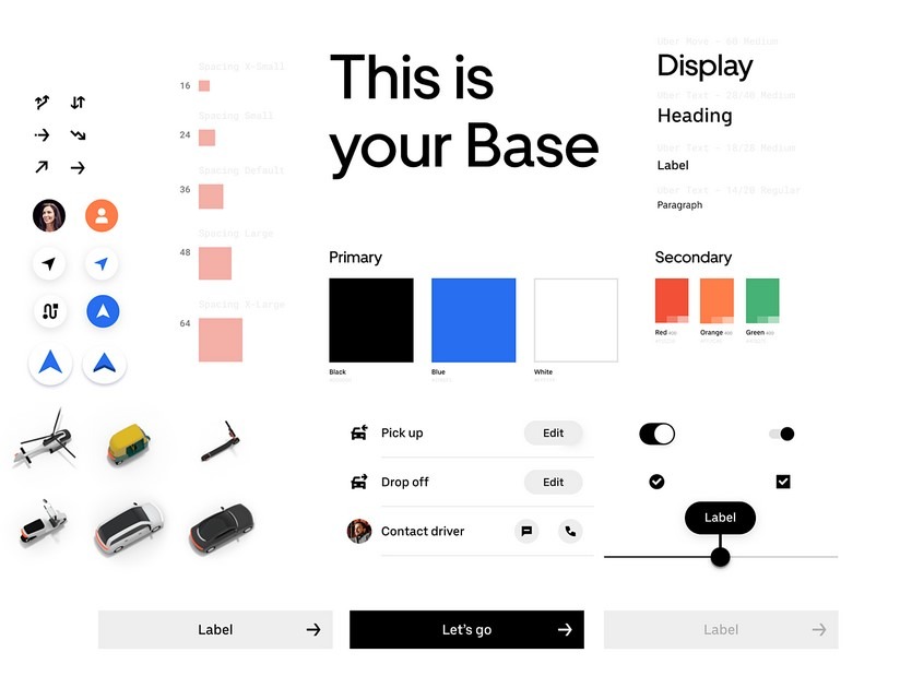
Przykładowa spójna baza elementów. Design System Ubera
Zapobiegaj błędom
Piąta z 10 heurystyk Nielsena mówi o zapobieganiu błędom. System powinien ostrzegać, na przykład, przed usunięciem konta, wymagać dodatkowych potwierdzeń, albo podsuwać podpowiedzi, w przypadku zakładania konta, aby użytkownik był informowany o konsekwencjach swojego działania.
Dobrym przykładem może być zastosowanie odpowiednich formularzy przy składaniu zamówienia. Podając swoje dane, na przykład kod pocztowy, widzisz, że musi być pięciocyfrowy, a numer telefonu powinien mieć 9 cyfr.
Unikanie błędów to też np. wykrycie słowa ”załącznik” w wiadomości mailowej i w przypadku braku jego załączenia zapytanie, czy na pewno wysłać bez załącznika.
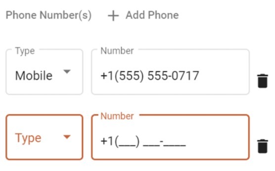
Formularz, który wskazuje oczekiwany format numeru telefonu w polu formularza
Pozwalaj wybierać, zamiast zmuszać do pamiętania
Użytkownicy powinni mieć możliwość łatwego dostępu do istotnych informacji bez konieczności ich zapamiętywania na poszczególnych etapach procesu. System powinien zapewniać stałą dostępność kluczowych danych, opcji i parametrów, aby wspierać użytkownika w podejmowaniu decyzji oraz realizowaniu kolejnych kroków bez zbędnego wysiłku. Jeśli system zmusza ich do pamiętania poprzednich wyborów, szczegółów zamówienia lub innych informacji, może to prowadzić do frustracji oraz błędów. Dlatego kluczowe jest, aby system „pamiętał” te dane za użytkownika i udostępniał je wtedy, kiedy są potrzebne.

W podanym przykładzie zamiast recznego pisania jest możliwość wyboru najpopularniejszych pytań do automatycznego uzupełnienia
Zapewnij elastyczność i efektywność
Doskonałym przykładem zastosowania w praktyce tej heurystyki jest możliwość stosowania skrótów klawiaturowych, co znacznie przyspiesza pracę przy komputerze. W odniesieniu do systemów przykładem zapewnienia efektywności może być możliwość dodawania przedmiotów do schowka lub do ulubionych.
Wyobraź sobie przeszukiwanie sklepu, na przykład z obuwiem, bez użycia filtrów. Jeśli ktoś interesuje się modą, albo ma na to czas, to może sobie na to pozwolić, jednak możliwość zaznaczenia, chociażby rozmiaru, czy koloru, a później zapisania wybranych filtrów, znacznie ułatwi zakupy. Ważna będzie także możliwość sortowania wyników wyszukiwania.
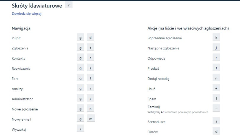
Zestaw skrótów klawiaturowych ułatwiających pracę w danym systemie zaawansowanym użytkownikom
Dbaj o estetykę i umiar
Estetyka danego systemu ma wpływ na jego odbiór przez użytkownika. Czołowy przedstawiciel modernizmu- Ludwig Mies van der Rohe, był wprawdzie architektem, ale jego pogląd na projektowanie zawarty w znanym aforyzmie: „mniej znaczy więcej”, jest aktualny również w przypadku projektowania systemów, stron internetowych i aplikacji. Jasność i przejrzystość w danej witrynie czy aplikacji sprawi, że użytkownik nie będzie przytłoczony nadmiarem informacji, grafik, ozdobników, a zatem z łatwością będzie mógł zrealizować zadanie, które chcemy, aby wykonał — dokona konwersji.
Każdy element interfejsu powinien być przemyślany, aby nie odwracać uwagi od istoty procesu. Na przykład w czasie zakładania konta w danym serwisie niepotrzebne będą żadne dodatkowe informacje oprócz uporządkowanego, przejrzystego formularza.
Przykładem minimalizmu jest nasza stroną, którą właśnie przeglądasz :)

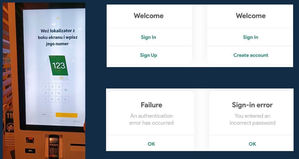
Zapewnij skuteczną obsługę błędów
Mimo wszelkich starań, błędy w systemie są czasami nieuniknione. Kiedy użytkownik napotka problem, kluczowe jest, aby komunikat o błędzie nie tylko informował go o wystąpieniu problemu, ale również jasno wyjaśniał jego przyczynę oraz sugerował możliwe rozwiązania. Zamiast pozostawiać użytkownika z frustracją i poczuciem zagubienia, system powinien prowadzić go przez kolejne kroki, które pomogą naprawić sytuację lub kontynuować pracę bez większych trudności.
Komunikaty błędów powinny być formułowane w sposób zrozumiały, przystępny i pozbawiony skomplikowanego, technicznego żargonu. Ważne jest, aby unikać niezrozumiałych kodów błędów czy technicznych skrótów, które mogą wprowadzić użytkownika w konsternację. Zamiast tego, komunikaty powinny jednoznacznie wskazywać, co poszło nie tak i jak użytkownik może wrócić na „właściwe tory.” Możliwe jest także dodanie opcji szybkiego działania, np. przycisku do cofnięcia operacji lub powrotu do wcześniejszego ekranu, co dodatkowo wzmacnia poczucie kontroli użytkownika nad sytuacją.
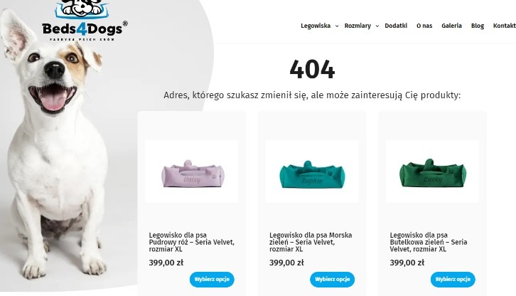
Przykład strony 404 dla nieistniejącego produktu, gdzie użytkownik ma szansę wybrać podobne produkty
Zadbaj o pomoc i dokumentację
Nawet jeżeli spełnisz wszystkie 10 heurystyk Nielsena w projektowaniu i stworzysz doskonałą stronę internetową czy aplikację mobilną, może się zdarzyć, że użytkownik będzie potrzebował pomocy (np. w sytuacji, gdy system jest bardzo rozbudowany i realizuje specyficzne funkcje). Powinna być ona łatwo dostępna, na przykład w dokumentacji online lub pomocy kontekstowej, dzięki której można odnaleźć odpowiedzi na najważniejsze pytania związane z działaniem systemu.
Ważna jest też możliwość bezpośredniego kontaktu z obsługą przez chat, e-mail lub telefon, aby każdy użytkownik znalazł odpowiednią pomoc przy napotkanym problemie.
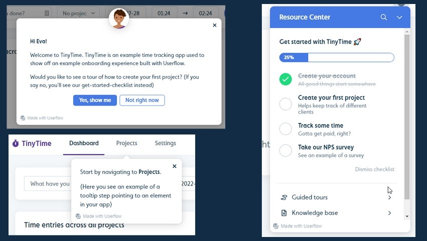
Komunikaty pomocy z narzędzia TinyTime
Heurystyki Nielsena – uniwersalne zasady dobrego projektowania
Znasz już 10 heurystyk Nielsena, które stanowią solidny fundament każdego procesu projektowania UX. Stosując się do tych zasad, masz szansę uniknąć wielu powszechnych błędów i znacząco poprawić jakość tworzonych interfejsów, czyniąc je bardziej intuicyjnymi oraz przyjaznymi dla użytkowników. Wykorzystanie tych heurystyk w praktyce pozwala na budowanie produktów, które nie tylko spełniają potrzeby techniczne, ale także dostarczają pozytywnych doświadczeń użytkownikom – niezależnie od tego, czy projektujesz stronę internetową, czy aplikację mobilną. Choć heurystyki Nielsena są stosunkowo ogólnymi zasadami, ich wartość tkwi w uniwersalności i prostocie. To właśnie one mogą stać się Twoim przewodnikiem na początku swojej przygody z UX. miarę zdobywania doświadczenia możesz pogłębiać swoją wiedzę, wprowadzając bardziej zaawansowane techniki UX, ale te 10 zasad pozostaną fundamentem, na którym będziesz opierać swoje projekty, bez względu na stopień ich zaawansowania.